|
|
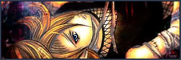
Post by Puppy on Feb 16, 2008 23:07:44 GMT -5
|
|
|
|
Post by CHaMY on Feb 17, 2008 19:46:47 GMT -5
wow u like making sigs  i like the devimaycry4 sig, purely coz it has nero init... GO NERO! |
|
|
|
Post by Kain on Feb 18, 2008 0:38:57 GMT -5
lol, u mean like the nero in ur sig? the 1 which is actually dante? ;D ;D i think the 1 in ur sig now is the best 1, the blending is awesome |
|
|
|
Post by KingLotus on Feb 20, 2008 21:08:10 GMT -5
very nice work ;D although to me in 2 or 3 of the sigs, the text color doesn't fit in real well, but nice blending and effects
|
|
|
|
Post by Puppy on Feb 22, 2008 1:35:29 GMT -5
posted newest
|
|
|
|
Post by Puppy on Mar 5, 2008 0:45:19 GMT -5
|
|
|
|
Post by Redz on Mar 5, 2008 11:55:11 GMT -5
That one is pretty Sweet.
In my opinion all your sigs have quite a "hard" look about them.
By using a Gaussian blur of about 0.5-0.8 on the BG it can make them look softer and you can get great depth.
|
|
|
|
Post by Puppy on Mar 5, 2008 13:07:04 GMT -5
I'll have to try that. Thx for the idea.  |
|
|
|
Post by Kain on Mar 6, 2008 18:14:45 GMT -5
the 1 with the gaussian blur looks good, makes the text stand out more
|
|
|
|
Post by Puppy on Mar 6, 2008 23:15:24 GMT -5
This is my SOTW2 entry  CnC please |
|
|
|
Post by Puppy on Mar 10, 2008 22:36:30 GMT -5
SOTW3 entry  reviews are loved! reviews are loved! |
|
|
|
Post by Kain on Mar 10, 2008 22:58:23 GMT -5
sotw 2 - i like the background stuff u have in there, only thing that kinda puts me off is the lighting, but i know its not easy to do lighting with anime
sotw 3 - good blending but id like to see more going on in the background, its kinda solid n not much texture.. lighting has improved a bit on this one also, gd job
|
|
|
|
Post by KingLotus on Mar 16, 2008 18:17:39 GMT -5
i like the SOTW3 sig, only thing is that the red space to the left of the guy is kind of plain. i'd suggest doing something with the space above your text. it would make it look less plain and bring the whole sig together
|
|
|
|
Post by jadewyvern on Mar 17, 2008 10:42:32 GMT -5
Hmm. I personally like the cleanness of the red space... it does have texture, not alot... but it also helps enhance the character (Sorry, IDK who that is) on the right. It's a nice balance. It makes the depths behind the fella fall back and you see the guy more. Just my two cents, and an alternate opinion... but then again, that's art... |
|
|
|
Post by Puppy on Mar 17, 2008 15:09:35 GMT -5
Thanx, I'm still not sure if I like it, but its not as bad as some i've done. Also, I haven't the slightest idea who it is either. Just found the pic online.
|
|


 I made this for someone on the 9D's site. I like it, but the text was making me mad.

 i like the devimaycry4 sig, purely coz it has nero init... GO NERO!