|
|
Post by Puppy on Mar 20, 2008 0:38:42 GMT -5
SOTW4

Once again, Reviews are loved!
|
|
|
|
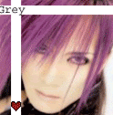
Post by Kain on Apr 8, 2008 11:07:50 GMT -5
wow, no1 has posted in here for a while  well, for the sig above.. the blending on the right side is good, but i think its a bit overdone on the left. nice job on the brush background, maybe add some light / shadow next time. |
|
|
|
Post by Necropenii on Apr 8, 2008 17:25:48 GMT -5
>_< Mana always looks so bored, lol.
Anywho, you need to add more depth to the image. And the random brushing looks a bit odd/misplaced. Perhaps you should take that out? The text placement doesn't look that nice, either. Overall, not bad, though.
|
|
|
|
Post by Puppy on Apr 10, 2008 14:31:27 GMT -5
Right, well for the battle I had two that I was flipping back and forth between. This is the second one. I think I like this one better, but on most other comps other than my own, it's very dark. But here it is anyway. CnC please CnC please
|
|
|
|
Post by Necropenii on Apr 10, 2008 14:37:12 GMT -5
I think you should add a bit more lighting, especially to the left side of his face, seeing how that's where the light hits. Also, an increase in brightness/contrast might help and maybe you could mess around with the colors. It's very nice, though. Good render. =)
|
|
|
|
Post by Puppy on Apr 23, 2008 21:06:22 GMT -5
New one, made it during bio earlier today. Some how I still mangaed to keep up with my notes too. No text this time, but I think it turned out alright.
|
|
|
|
Post by Puppy on Apr 29, 2008 14:52:05 GMT -5
Here's a few new ones. It's a new style for me, but I don't thnik they're to bad.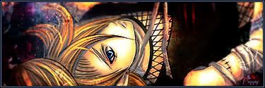 SOTW: 
|
|
|
|
Post by Rubyeye on Apr 29, 2008 15:19:21 GMT -5
I like them  Love how you always manage to fill up your background nicely.. that is one of the many things I lack when making sigs  You should really make a tut for the 2nd sig! the more I look at it, the more I like it.. |
|
|
|
Post by Puppy on Apr 29, 2008 19:27:05 GMT -5
Unfortunately theres a couple of problems with doing that, 1: I never remember exactly what I do to make the sig(even tho I keep the Photoshop image) and 2: I don't know how to make a tut.  Otherwise I would love to make one, might have to ask kain to help me. |
|
|
|
Post by Kain on Apr 29, 2008 19:40:28 GMT -5
im sure i could do that  |
|
|
|
Post by Puppy on Apr 29, 2008 20:14:19 GMT -5
Yayness!!
|
|
|
|
Post by Puppy on May 14, 2008 12:14:08 GMT -5
Well for this weeks SOTW I had two entries to choose from I went with Hitsugaya. But idk. SO here they are:   CnC please CnC please |
|
|
|
Post by Kain on May 15, 2008 11:16:15 GMT -5
the depth is really good on the first one but i think the focal is a lil oversharpened and the border contrasts a lil too much.. well blended and good lighting though.
the second one is again, well blended but theres not really a lot u could have done with lighting on that one... background is a lil plain for me as well, not really much going on.
|
|


 Otherwise I would love to make one, might have to ask kain to help me.